Introduction
In today’s digital landscape, where smartphones and tablets have become an integral part of our lives, the importance of responsive web design cannot be overstated. With a growing number of users accessing websites on mobile devices, crafting sites that provide an optimal viewing and interaction experience across various screen sizes and devices has become a fundamental requirement. This article delves into the concept of responsive web design, its benefits, and how to effectively implement it in a mobile-first world.
Understanding Responsive Web Design
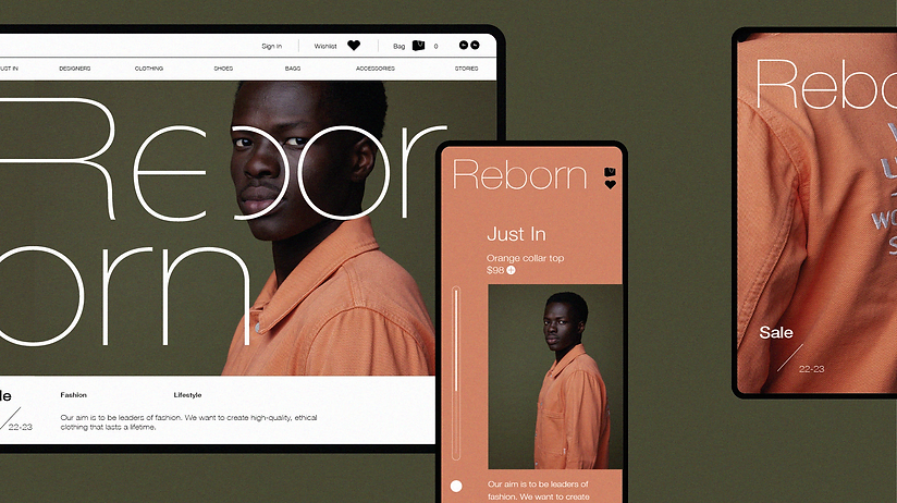
Responsive web design is a design approach that ensures a website’s layout, images, and other elements adjust seamlessly to different screen sizes and orientations. Rather than creating separate versions of a website for desktop and mobile devices, responsive design allows developers to create a single site that adapts to the user’s device.
Benefits of Responsive Design
- Enhanced User Experience: With responsive design, users can access your website on any device without encountering usability issues. This consistency leads to a better user experience and keeps visitors engaged, reducing bounce rates.
- Mobile-First Approach: The mobile-first approach, a key principle of responsive design, emphasizes designing for mobile devices first and then scaling up for larger screens. This approach ensures that the site’s core content is prioritized, improving performance and load times on mobile networks.
- SEO Advantage: Search engines, including Google, favor responsive websites in search results, as they provide a better user experience. Responsive sites are more likely to rank higher in search engine results pages (SERPs).
- Cost and Time Efficiency: Managing a single website that caters to multiple devices is more efficient than maintaining separate versions. This approach reduces development time and costs associated with creating and updating multiple sites.
Implementing Responsive Design
- Flexible Grids: Employ fluid grid layouts using relative units like percentages instead of fixed pixel values. This allows content to adjust proportionally to various screen sizes.
- CSS Media Queries: Media queries enable you to apply specific styles based on screen characteristics such as width, height, and orientation. This helps tailor the design for different devices.
- Images and Media: Use CSS to make images and media elements scale with the screen size. Additionally, consider using responsive images that load different sizes based on the device’s capabilities.
- Viewport Meta Tag: Set the viewport meta tag in your HTML to ensure that the website is displayed at the appropriate scale on different devices.
- Testing and Optimization: Regularly test your site on various devices and browsers to identify and resolve any responsiveness issues. Optimization ensures that the site performs well across different platforms.
Web Accessibility and Inclusivity
While crafting responsive designs, it’s crucial to consider web accessibility. Ensure that your site is usable by individuals with disabilities, including those using screen readers or assistive technologies. Implementing semantic HTML, proper heading structure, and keyboard navigation are essential steps toward creating an inclusive experience.
Conclusion
Responsive web design is no longer an option but a necessity in a mobile-first world. By embracing this approach, web developers can create sites that provide a consistent and enjoyable user experience across diverse devices. Implementing responsive design principles, such as flexible grids and CSS media queries, ensures that your website remains accessible and engaging for all users, irrespective of their chosen device. As technology continues to evolve, responsive design will remain a cornerstone of effective web development, facilitating seamless interactions in our increasingly mobile-centric world.